You are using an out of date browser. It may not display this or other websites correctly.
You should upgrade or use an alternative browser.
You should upgrade or use an alternative browser.
C3 Race Car Build
- Thread starter Oneball
- Start date
Oneball
CCCUK Member
The Daytona Has always been my favourite car. A friends dad bought one new, kept it for about 3 years then traded it in for the all new 365BB Berlineta Boxer, which he still has.
When I was little they were the cheap ones along with Carrera 2.7RS. There was a TV series with Clive Owen, Chancer I think, and he bought his girlfriend a yellow 2.7RS because he couldn’t afford a new 1980s 911.
Forrest Gump
CCCUK regional rep
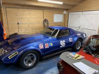
The trouble is we’ve got used to seeing how great the car looks without the stickers! I really like the pinstripe too, it adds character.Me too at the moment. Can’t work out why they don’t work. I did try them in more than one place. Maybe they’re too big. Or too many.
Would it work if the stickers are nearer the middle of the gap between the pinstripes, to follow the flow line created by the pinstripes. The Cibie sticker position look good to me but the others look line they’re hanging off the top stripe. Bilstein sticker first maybe over the gills?
Oneball
CCCUK Member
The trouble is we’ve got used to seeing how great the car looks without the stickers! I really like the pinstripe too, it adds character.
Would it work if the stickers are nearer the middle of the gap between the pinstripes, to follow the flow line created by the pinstripes. The Cibie sticker position look good to me but the others look line they’re hanging off the top stripe. Bilstein sticker first maybe over the gills?
I think if they were smaller they’d follow the line better. Might give that a try and if it doesn’t work just leave it as is.
antijam
CCCUK Member
If you ain't getting direct sponsorship and unless your race series requires them as part of a sponsorship deal why would you stick them on? - the lines of your car look better without them.If only!
teamzr1
Supporting vendor
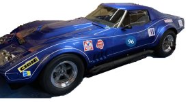
The area enclosed with the pinstripping is shallow which reduces the free space for the stickers, and being square ones
makes it even harder to place and look right
The 2 numbers are too large to where they are blending in with the white of pinstripe
Maybe go with a round decal of another color and then choose the color of the numbers to blend in ?
makes it even harder to place and look right
The 2 numbers are too large to where they are blending in with the white of pinstripe
Maybe go with a round decal of another color and then choose the color of the numbers to blend in ?

Roscobbc
Moderator
My 'take' would be to use the only horizontal reference pinstripe lines you have (within your pinstripe border - just above the bottom of the door) and starting with the largest rectangualr sticker build-up vertically abnd then horizontally a 'mosaic' beginning with the Cibie sticker, the Valvoline, IMSA and the other two currently on the cars rear flank. Working upwards and outwards from there using any mix of irregular shaped sticker to fill the space and 'balance' the amount of blue paintwork visible.
Oneball
CCCUK Member
The numbers are just ones I’d got lying around. Not all of them are square, but the backing paper is.
The numbers need to be a thinner typeface. As for the stickers, I think smaller ones that can then be grouped might work. If it doesn’t it’ll stay blank apart from the ones I have to run.
The numbers need to be a thinner typeface. As for the stickers, I think smaller ones that can then be grouped might work. If it doesn’t it’ll stay blank apart from the ones I have to run.
johng
CCCUK Member
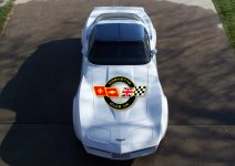
I think a large club logo on the bonnet and perhaps behind the rear window (or possibly on the doors, if the numbers were moved to the front or back of the doors) could look good. Could the club sponsor you by paying for some specially large decals as Ross suggested a few days ago?
Oneball
CCCUK Member
I think a large club logo on the bonnet and perhaps behind the rear window (or possibly on the doors, if the numbers were moved to the front or back of the doors) could look good. Could the club sponsor you by paying for some specially large decals as Ross suggested a few days ago?
Not really sure about being paid for stuff like that, and not too keen on anything too big and modern.
Nassau65
CCCUK Member
Perhaps a ccc Uk logo from the past might be better. Can’t remember what they looked like from the 80’s maybe one of those? Agreed on not too big tho.Not really sure about being paid for stuff like that, and not too keen on anything too big and modern.
teamzr1
Supporting vendor
Forget the stickers, you cannot go faster with them 
But this new GM crate 672 CI N/A carb Big block engine with 1,000 HP and 900 ft/lbs of torque will help you get wins !
1000 HP crate engine
also a tranny that can handle to power on same page
But this new GM crate 672 CI N/A carb Big block engine with 1,000 HP and 900 ft/lbs of torque will help you get wins !
1000 HP crate engine
also a tranny that can handle to power on same page
Last edited:
Nassau65
CCCUK Member
Things always go faster with stickers and stripes on themForget the stickers, you cannot go faster with them
But this new GM crate 672 CI N/A carb Big block engine with 1,000 HP and 900 ft/lbs of torque will help you get wins !
1000 HP crate engine
also a tranny that can handle to power on same page
Oneball
CCCUK Member
Wont fit under the bonnet!!!Forget the stickers, you cannot go faster with them
But this new GM crate 672 CI N/A carb Big block engine with 1,000 HP and 900 ft/lbs of torque will help you get wins !
1000 HP crate engine
also a tranny that can handle to power on same page
Anyway I already have a faster plan for the future
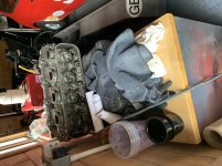
Nassau65
CCCUK Member
Not more stripesWont fit under the bonnet!!!
Anyway I already have a faster plan for the future
View attachment 17238
only joking, car looks fantastic.
johng
CCCUK Member
Nassau65
CCCUK Member
As I mentioned before, perhaps one of the previous logos from the early 80’s might look more period.I was thinking it might look like the firebird on a Trans Am, but having tried it out I think you're right it's too modern.
View attachment 17239


